The League of Moveable Type
Gallery-level curation in democratic space

In 2009, I stumbled onto a thread on Typophile—a well-known typography forum—where someone had asked about open-source fonts. The response was immediate and hostile.
"How dare you?"
"This will destroy our profession."
"Real designers pay for type."
I'd just started teaching myself to code, and open-source had been essential to my learning. Programmers shared knowledge freely, helped each other grow, built on each other's work. It felt generous and collaborative. But typography—the thing I loved most—had this wall around it. If you couldn't afford $200-800 per font family, you didn't deserve good typography. The professionals were explicit about this: asking for free fonts was insulting their craft.
Working at A Good Company with Caroline, I'd seen how sharing everything—open files, honest critique, knowledge without gatekeeping—made the work better, not worse. The hostility on that forum wasn't about protecting standards. It was about protecting their power.
What bothered me wasn't that commercial foundries charged for their work. That's fair—skilled craft deserves fair compensation. What bothered me was the assumption that quality and accessibility were contradictory. That open-source meant unprofessional standards.
But also—and this is important for understanding what The League became—browsers had just started supporting @font-face as experimental new technology. For the first decade of web design, if you wanted custom typography, you used Photoshop to generate images and then employed complicated text-image replacement techniques. Tedious, messy, limiting. The technology was finally here to use real fonts on the web, but the great foundries wouldn't license for it. They were terrified of font theft, even though their fonts were already being pirated. They just weren't participating.
Free fonts existed in 2009, but only a handful were actually open-source—and to be fair, most of the free fonts out there were garbage. Poorly kerned, incomplete character sets, amateur construction. Using them marked you as someone who either couldn't afford better or, worse, couldn't tell the difference. The typography industry liked this arrangement: quality through pricing, enforced by gatekeeping.
The web needed something that would drive it forward. High-quality typography that was actually usable. But it also needed taste. Standards. Not just a repository of "free stuff."
I'd been obsessed with secret societies for years. Senior year of college, I'd pitched creating one as my thesis project—my professors shut it down. But that fascination stayed with me. The psychology of secret societies and luxury operates on similar principles: scarcity, curation, the power of saying no, the desire created by exclusivity. All of it fascinating.
When I started thinking about this open-source font foundry, I realized something: I wanted it to carry the weight and authority of the great historical foundries. Names like Monotype, Linotype, Bauer Type Foundry—they sounded like they'd existed for a century. They commanded respect through heritage.
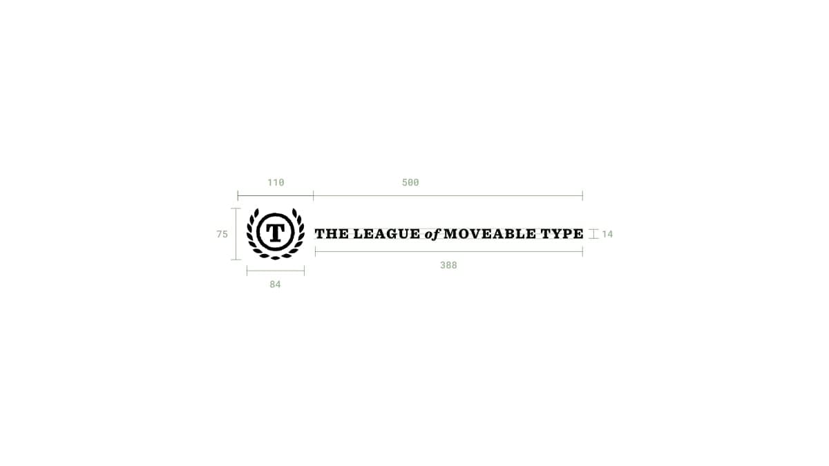
So I named it The League of Moveable Type. Victorian-era phrasing. Old, established, serious. It sounded like it could have been founded in 1900. That was intentional.
Then I wrote the manifesto.

A manifesto is a heavy artifact — it plants you firmly in the seeds of history and makes your position clear. And the one that's live today is the same one I wrote when I first had the idea. It wasn't market-tested or softened over time—it was the founding document, and it stayed that way.
The insight was this: Open source is for everyone. Being part of The League doesn't have to be.
Anyone could use the fonts. Anyone could create open-source fonts. But not everyone could publish them on The League.
I could maintain gallery-level standards through editorial curation. The defining factor became literally my taste—one opinionated leader making the hard calls about what belonged in the collection and what didn't.
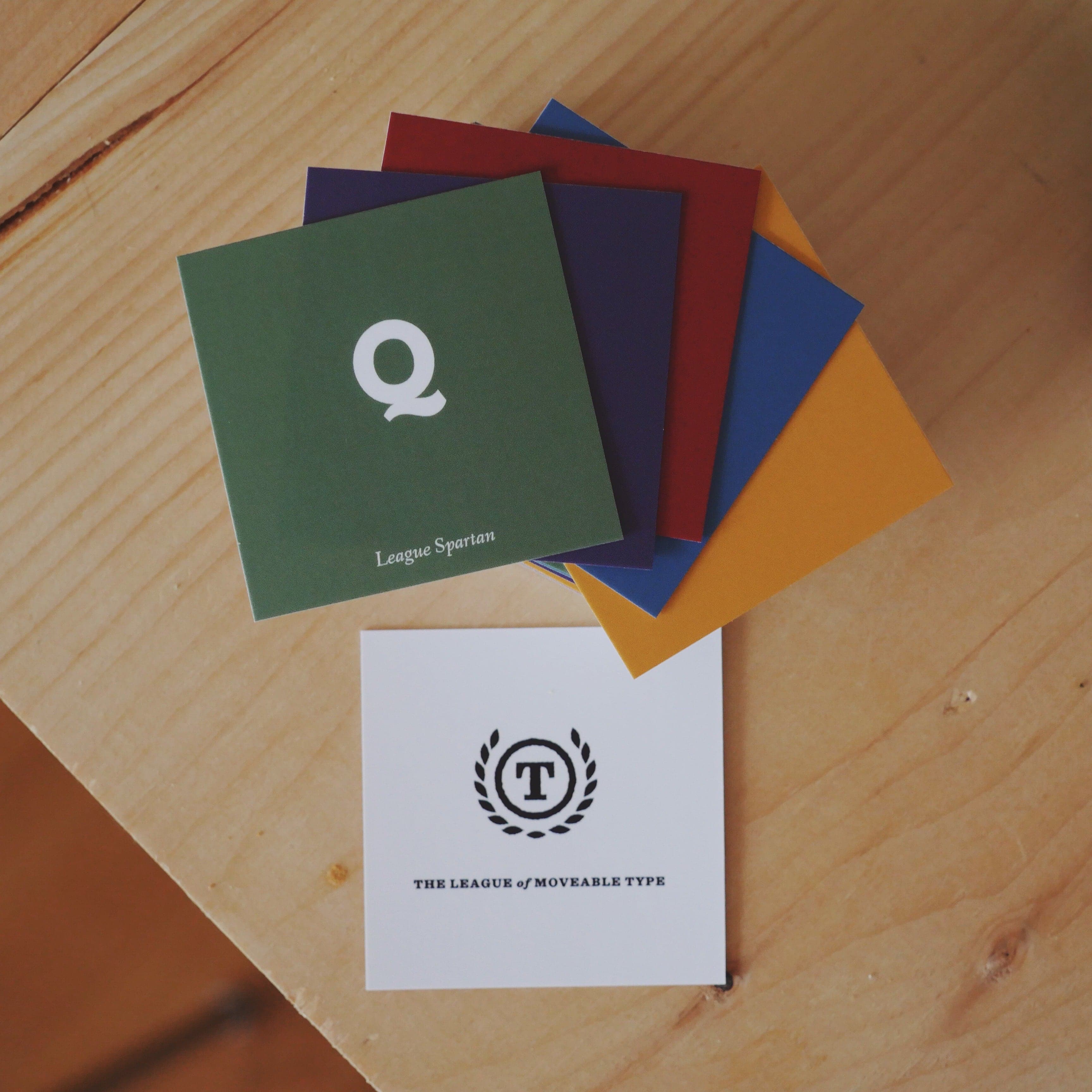
I teamed up with Caroline—my design partner from A Good Company—and we polished and published her college type project as the first League font.
Then I built everything else. Designed the brand identity that felt century-old. Designed and built the website. Designed specimen pages for each font that looked like they belonged in a museum. Wrote the manifesto. Built the submission and evaluation system. Set up hosting, domain management, email infrastructure.
I said no. A lot.

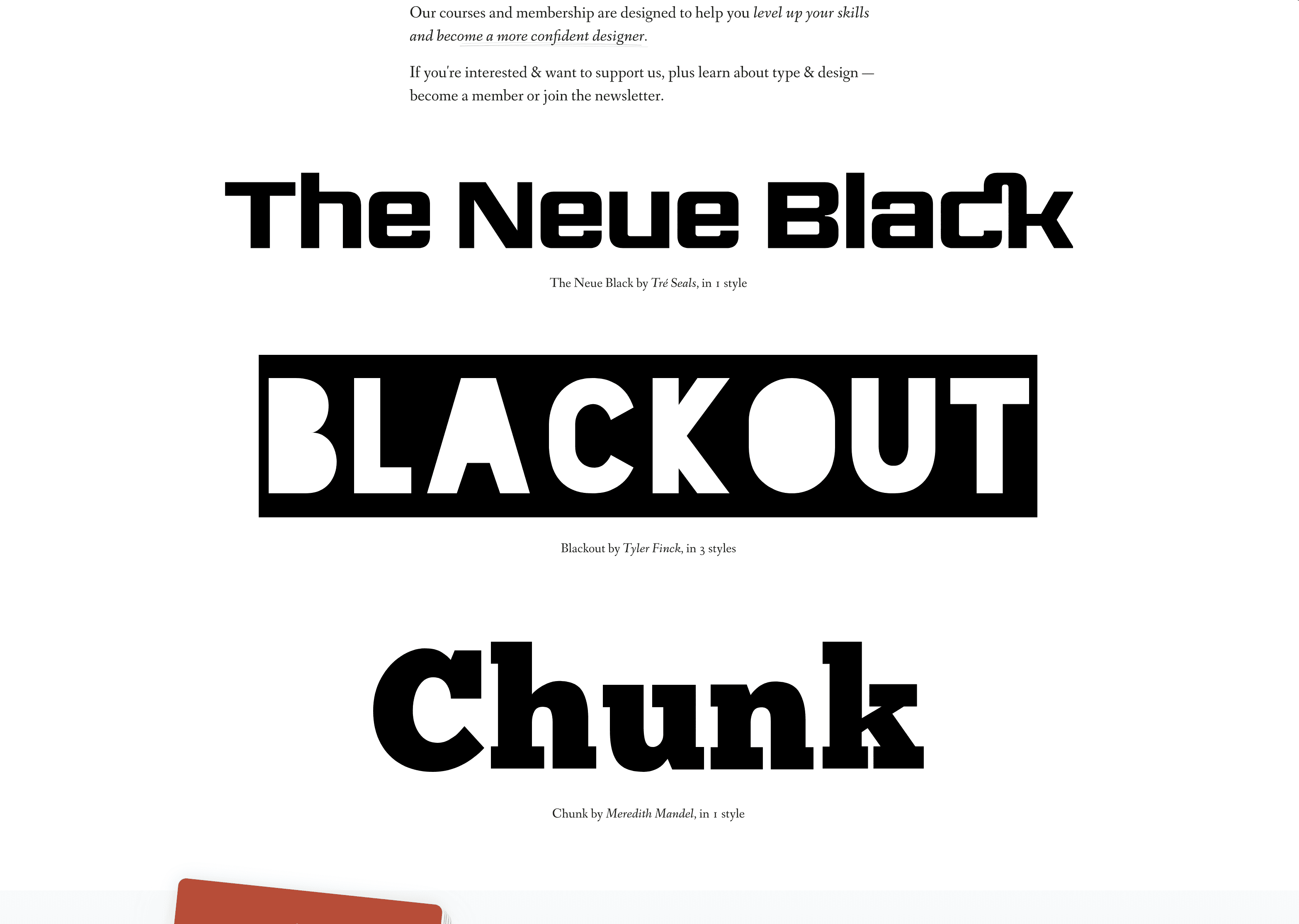
Every typeface submission got evaluated against one question: Would I pay $200 for this if it were commercial? Reasonable character sets, professional kerning (sometimes hundreds of pairs, tested across use cases), often multiple weights, sometimes even variable, good lines and curves and optical quality at high magnification. If it was "pretty good for free," it wasn't for us. Some fonts took years to reach publication quality.
We published 18 typeface families over 16 years. Each one passed the same scrutiny as commercial releases charging hundreds of dollars per font.
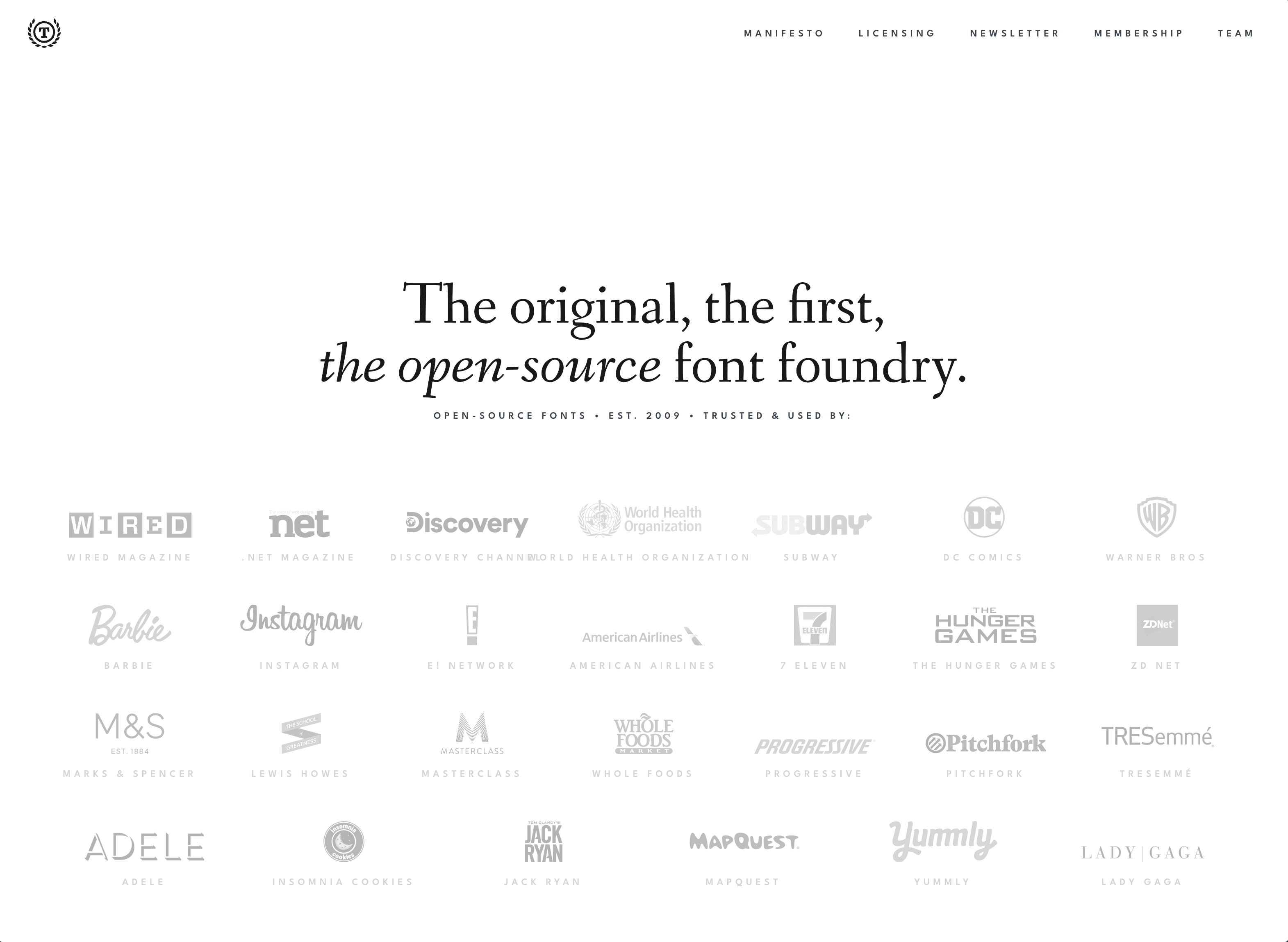
Those 18 families got used by NBCUniversal, Instagram, the Obama campaign, Lady Gaga, The Hunger Games, DC Comics, Wired, Pitchfork, Whole Foods, MasterClass. Quality compounded—each release reinforced the standard.
What I didn't know in 2009 was how to make this sustainable. Free fonts meeting luxury standards—how do you build a business around that? So I tried everything.
First, sponsored content. Partnering with brands to create valuable pieces aligned with our mission. I was good at writing the copy, but it didn't feel scalable, and I worried we'd become a content farm. It worked, but didn't feel deep enough.
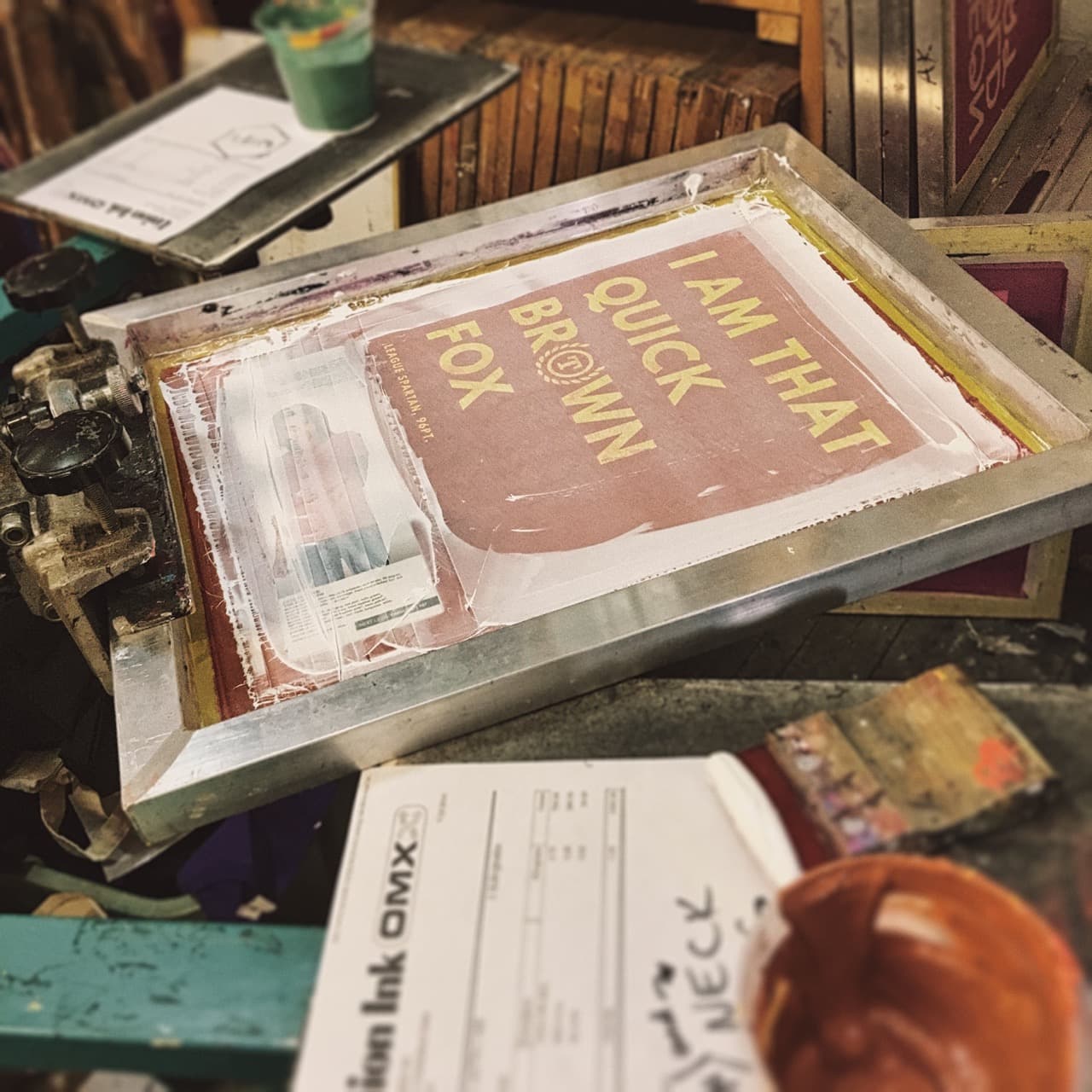
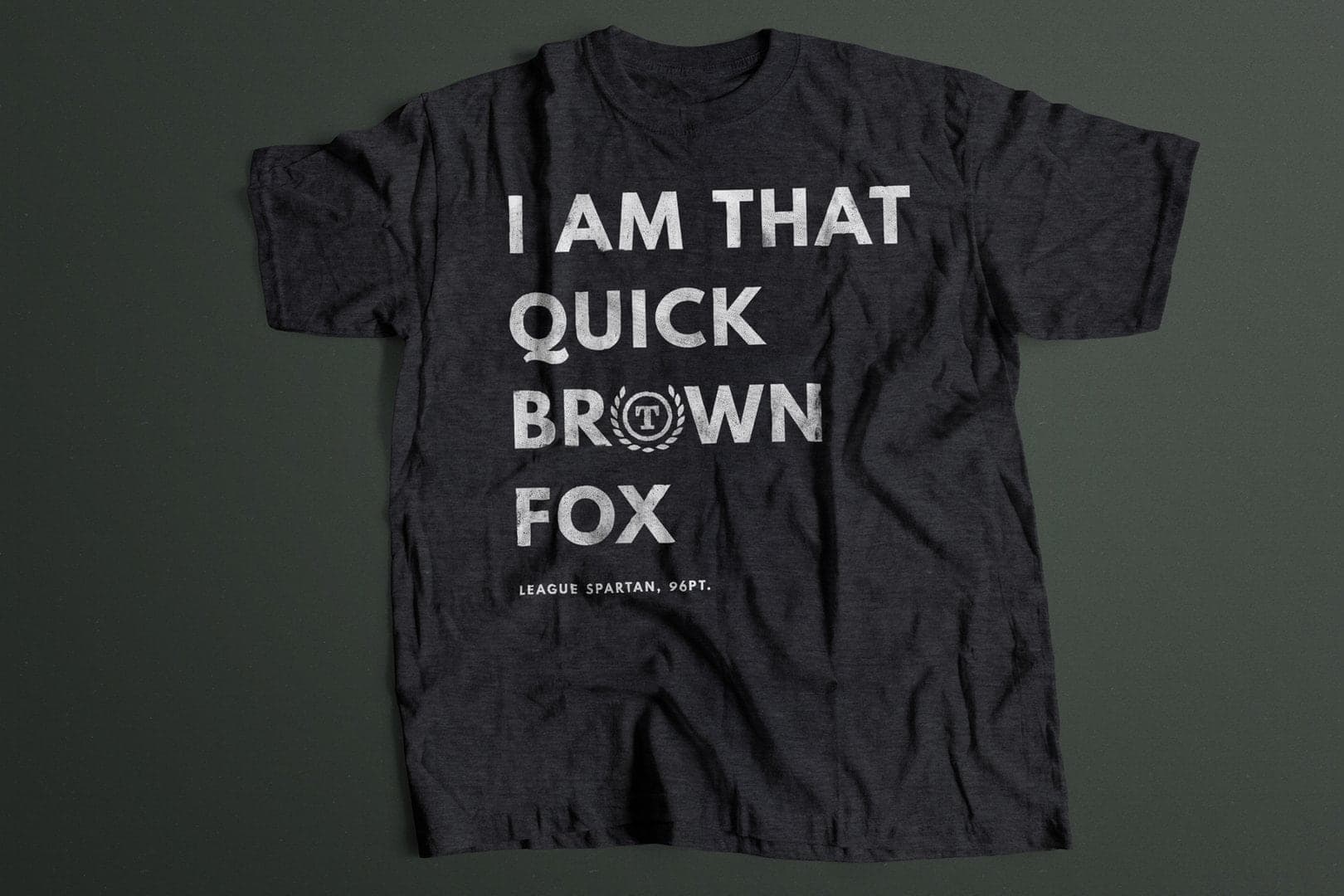
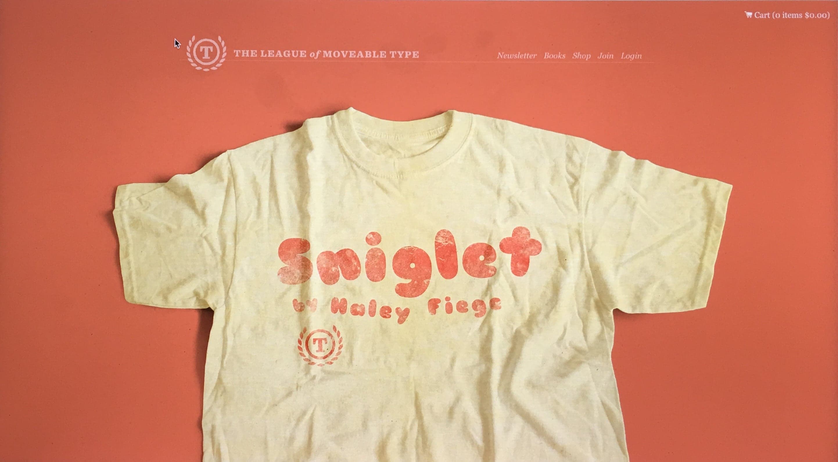
Then merchandise. I designed "The Quick Brown Fox" tee—a statement piece for designers who understood the reference. Sourced soft fabrics from Brooklyn suppliers, managed screen printing quality control myself, designed and built the e-commerce system, designed and ran email campaigns that sold out multiple batches. Packaged and shipped orders from my apartment with hand-written notes thanking each customer.
I was curious to try a limited printing. So I said it was, and when it sold out, I never made it again. People still ask me to this day for one — only me, my best friend, and anyone who bought has one. There's something... oddly satisfying about the power of sticking to that.
But eventually I did find a good print-on-demand service out in Los Angeles, and went to visit them and discussed their standards and fabrics, and built an e-commerce site to test working on other merch designs. It worked for a while, but it didn't feel as meaningful as I knew The League could be.
Then custom typography. We pursued commissioned typeface expansions—working with brands to create custom versions of our fonts. This let us maintain open-source principles while generating revenue. It meant I got to flex my client and negotiation skills, fighting on behalf of type designers who'd contributed to open-source, securing them real financial support. We got to work with major brands like NBCUniversal and the E! Network.
But it also led to frustration — I already had made my own design agency once, I didn't need another. It proved open-source could be a viable business model, but like any high-touch business, it was a lot of work, and it didn't feel like the deep core truth of what we were supposed to be.
The breakthrough came from teaching. After my time at General Assembly, I was hooked on education. I started staying up late writing in-depth typography lessons, designing newsletter layouts that made complex topics approachable, and sending them out every week.
The response surprised me. Designers weren't just hungry for fonts—they were starving for knowledge. They wanted to understand what they were using, why certain choices mattered, how to see what they were looking at. Most designers use typography aesthetically, unaware of the craft behind letterforms, unaware of what makes something well-constructed versus amateur.
It got me thinking quite a lot about what we might be able to offer.
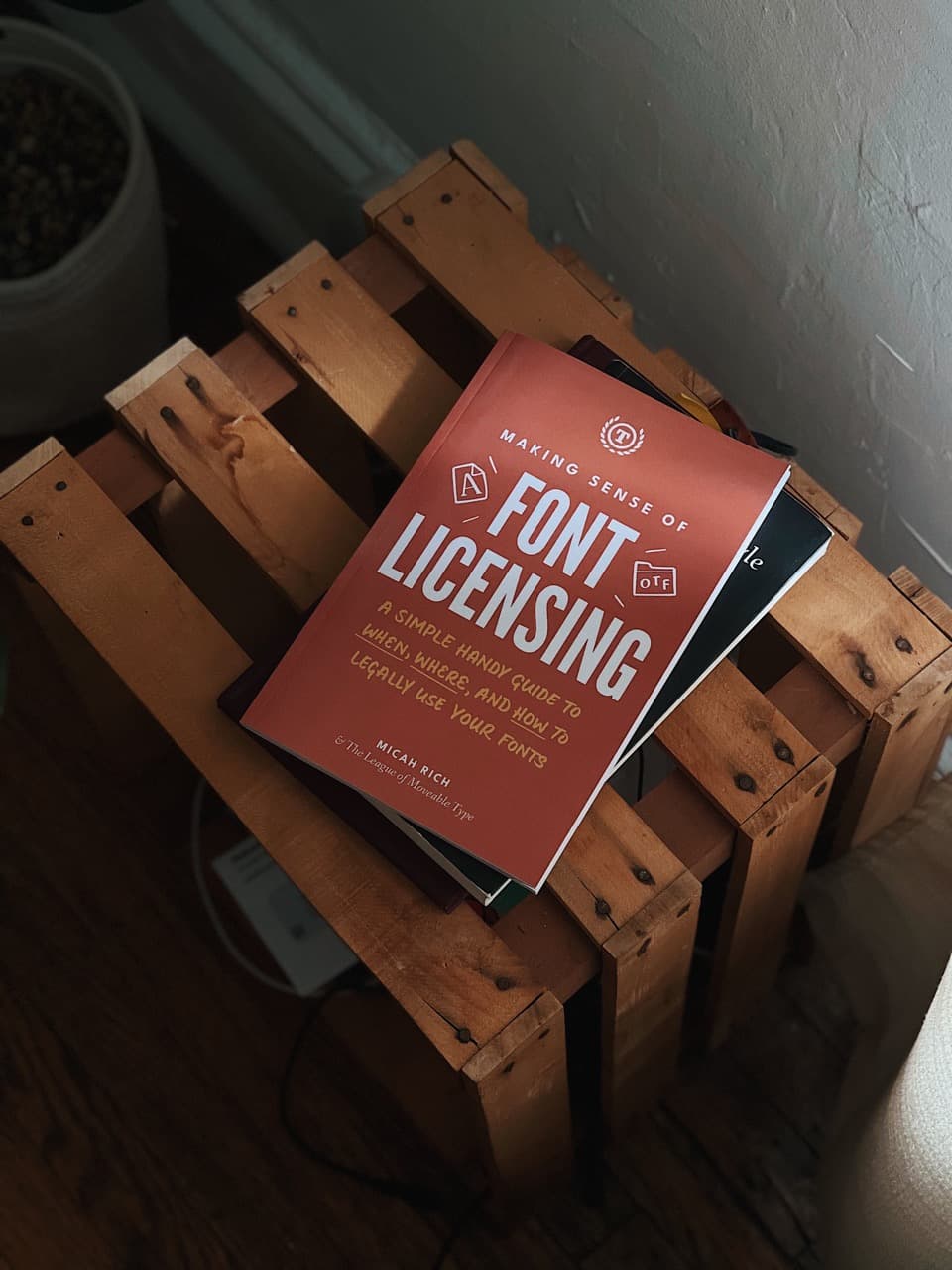
I wrote and designed "Making Sense of Font Licensing" — my first book — in a cafe in Los Angeles over a long weekend.
It was the first time I'd written something that in-depth, and I had no idea writing a book was even possible for me. But it really turned out to be just dumping so much of what I already had in my brain from years of experience, and using my teacher skills to organize and write it in a way that felt less overwhelming. I designed the cover, laid out the pages, published it myself.

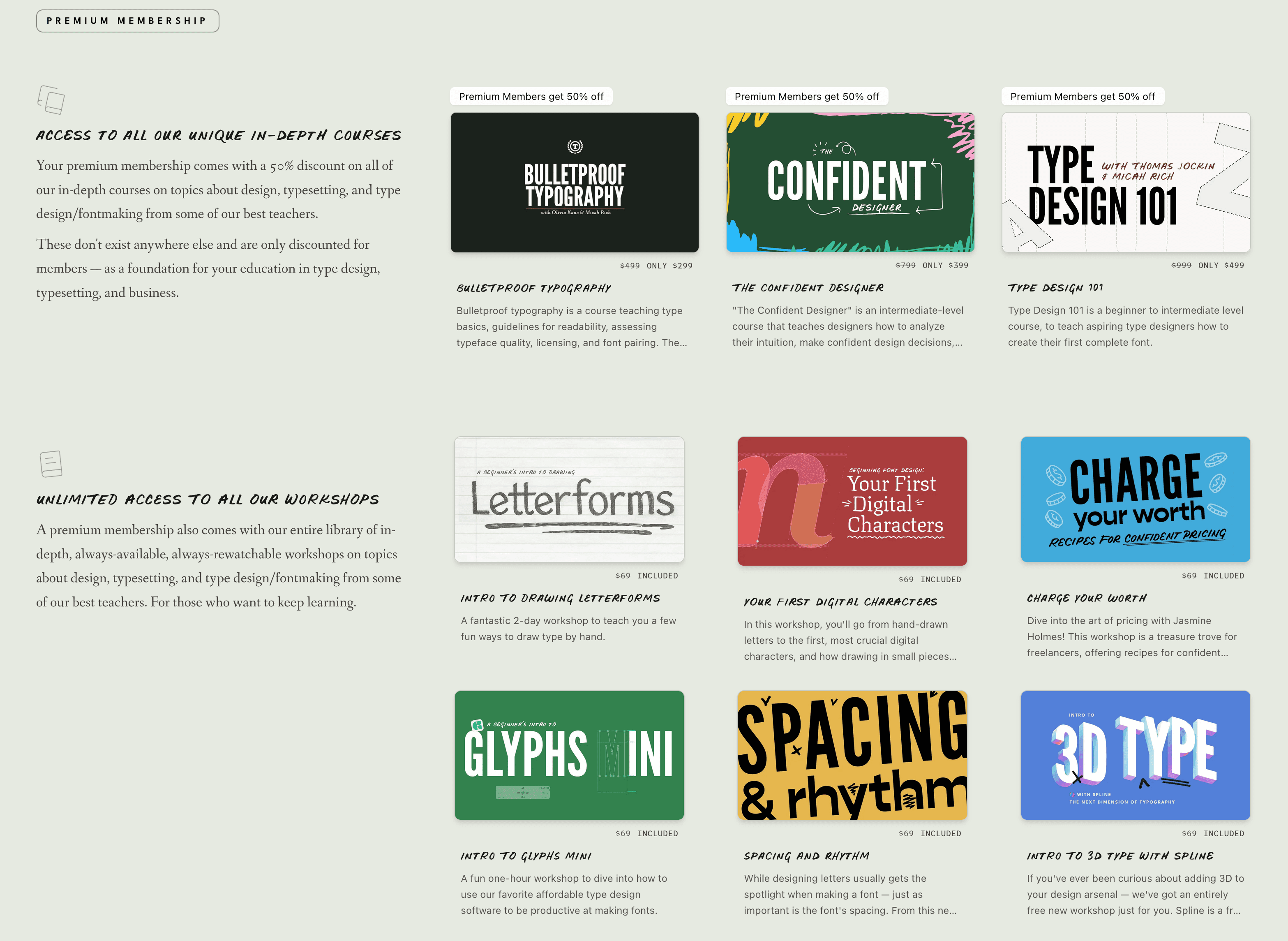
Then I developed our first major course on type design fundamentals—partnering with Thomas Jockin from TypeThursday to develop the curriculum. I designed the course platform UI and built it, shot and edited all the video content, designed the marketing materials, built the email funnels, handled all the technical infrastructure. Later rebuilt the entire platform as it expanded to host workshops and courses with other industry leaders.
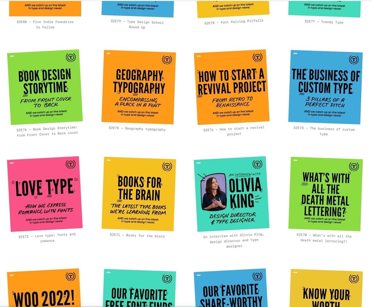
At some point, we launched a typography podcast with Olivia, curating news and trends every week with deep dives on typography topics and interviews with experts. 141 episodes over multiple years.
I'm still developing deeply thoughtful courses and learning paths today, to both teach and curate the best typography education.
We're building what feels like the best design school in the world, online, accessible to everyone, delivered in a way that hasn't been done before.
Of course, the educational approach wasn't entirely altruistic—it was strategic, too. Educated designers use type better and see the value of quality typography, and helping beginners makes customers for life, if you treat them well and do a good job.
But we've taught people to see what they were looking at. Once you understand type construction, you can't unsee quality differences. You become an advocate for good typography without us having to convince you.
Looking back at 16 years, each experiment taught me something. The failures showed what didn't work, the successes pointed toward what did, obviously. But running every aspect of this business—from designing brand identity to building platforms to shooting video to negotiating with NBCUniversal to packing boxes—built a rare skill set. Most creative directors have never shipped production code or run a profitable e-commerce operation or self-published a book. I did all of it.
And it was a brand I not only believed in, but one I'd built entirely myself.
Our work started appearing everywhere. Indie magazines to major websites, student projects to corporate identities. Design educators included our fonts in curricula. We've been used in 204 countries, served 50,000+ designers over time, with 15-30K monthly site visitors regularly for years. I've personally helped develop 12+ curated workshops, 3 in-depth courses, and 141 podcast episodes over 6 years. Our fonts have been used by major brands (NBCUniversal, Instagram, Whole Foods, MasterClass), entertainment (Lady Gaga, The Hunger Games, DC Comics), media (Wired, Pitchfork), and politics (Obama's campaign).
But more than metrics, what The League proved is that you can operate with luxury principles while democratizing access.
I think about typography and hospitality as service of invisible craft.
Good typography serves the reader without announcing itself—the right spacing, the comfortable line length, the hierarchy that guides your eye without you noticing. Good hospitality anticipates needs without being servile—the water glass refilled before you ask, the temperature just right, the details that make you feel cared for without feeling managed.
Both require obsessing over things most people never consciously notice but everyone feels.
Curation is service, too. When I say no to fonts that don't meet the standard, I'm serving the people who look to us for taste. They trust I've maintained standards so they don't have to evaluate every option. Like a good sommelier who offers fewer choices but higher confidence. The editing is the service—saying no to protect the people who trust your judgment.
This is what luxury sometimes means — not always expensive materials or exclusive access. It's maintaining uncompromising standards regardless pressure. It's refusing to publish something that's "pretty good" because you know the difference between pretty good and excellent, and you care enough to hold that line.
The League has stricter curation than many commercial foundries charging $200 per font. We maintained gallery-level standards while serving 30k+ people a month. We've been ferociously selective while being radically generous, and literally helping shape the history of fonts on the web. We controlled every decision with singular vision while building a loyal community.
And heritage — a staple of crafting the mythology behind a true luxury brand — can be constructed through visual language and standards. I branded us like a century-old institution from day one, and the authority to maintain that image has come from what we refused to concede.
Luxury is a mindset, not a price point.
Project Details
- 18 open-source typeface families used in 204 countries by NBCUniversal, Instagram, Obama campaign, Lady Gaga, DC Comics, Wired, Pitchfork, Whole Foods, MasterClass
- Complete brand identity, manifesto, and Victorian-era naming strategy
- Full-stack platform (Ruby on Rails → Next.js/TypeScript): website, font specimens, submission system, e-commerce
- Education platform: 3 in-depth courses, 12+ workshops, 141 podcast episodes (215K+ listens)
- Merchandise line: designed products, e-commerce system, fulfillment operations
- Authored and self-published: Making Sense of Font Licensing
- Newsletter system with custom layouts reaching 50K+ subscribers (26% open rate)
- Video production: shot, edited, and produced educational content